Representative Website Development Projects
So, how can you use my website development skills? Do you have a business that needs a web presence? Do you have a website that was build with a "drag-and-drop" like Wix and it's time to get past their limitations and "canned" look? Is it time to add functionality like updatable calendars of events, booking capabilities, or a e-store? Do you have images that you'd like to use in a "slideshow" to help get your message across with examples quickly and easily?
The face of the web has changed a lot, and yet, many things behind the scenes haven't. My approach to website design and development is to use what works across all available technologies, no more, no less. I use both software-generated and hand coding to flesh out web pages, again, using what works best in each area. I am proficient in both HTML and CSS coding; I buy and configure highly reliable, ready-made (php) scripts for complex functionality - it's cheaper for you, easier for me, already proven, and faster to get the results we both want.
The examples provided here cover a variety of styles, functionality, and client requirements.
Please note: The initial version of these websites were designed and built by me. Clients are free to edit/overhaul their websites at any time, as they see fit. No guarantees are implied that these websites are the same as when I first created and implemented them.
Website Design Example: Ad Agency
|
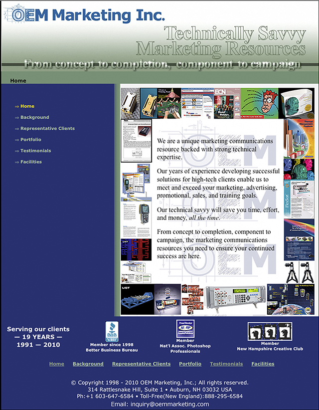
This example is the website for the technical marketing/ad agency I founded and ran for 20 years. This site was our main sales and marketing platform; everything else we did - print ads, mailings - pushed prospective clients here, which in my opinion, is how it should work. Prospective clients could learn as much or as little as they wished about what we did, who we did it for, and how a relationship with us would work. |
|
Top of Page
Website Design Example: Display Fireworks Company
|
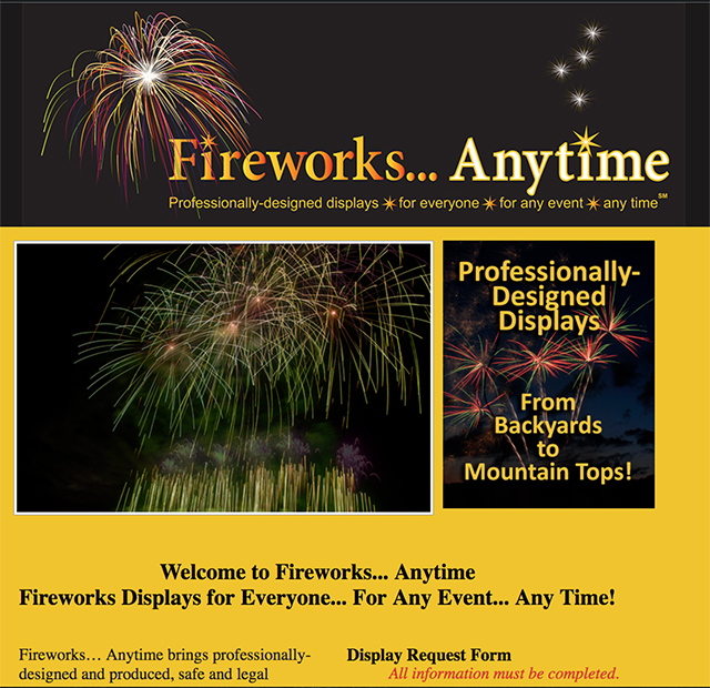
This is the website for a display fireworks company. Display fireworks are the large ones you see on July 4th, not the consumer stuff you can buy yourself (depending on what state you live in.) |
|
Top of Page
Website Design Example: Packaging Equipment Manufacturer
|
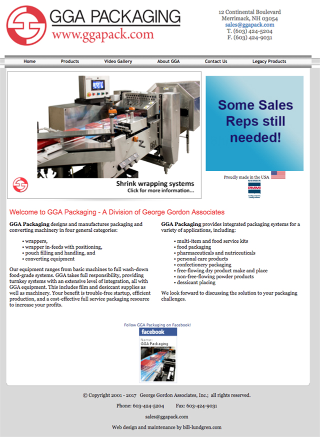
This example is for one of our agency clients who made/makes packaging equipment, primarily for the food service industry. This particular website has a number of functional features including two, tandem, homepage slideshows, three-tier menues, and zooming images.
|
|
Top of Page
Website Design Example: Custom Kitchen/Bath Cabinet Manufacturer
|
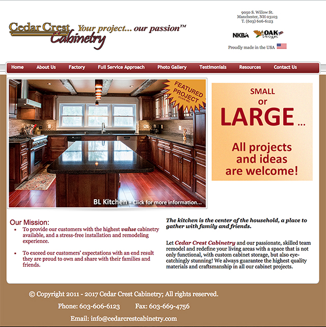
This example is for one of my personal clients who makes high-end custom cabinetry for kitchens and bathrooms. This website also has a number of functional features including two, tandem, homepage slideshows, two-tier menues, and zooming images. The image capture shown here shows the cabinets they did for my personal kitchen. |
|
Top of Page
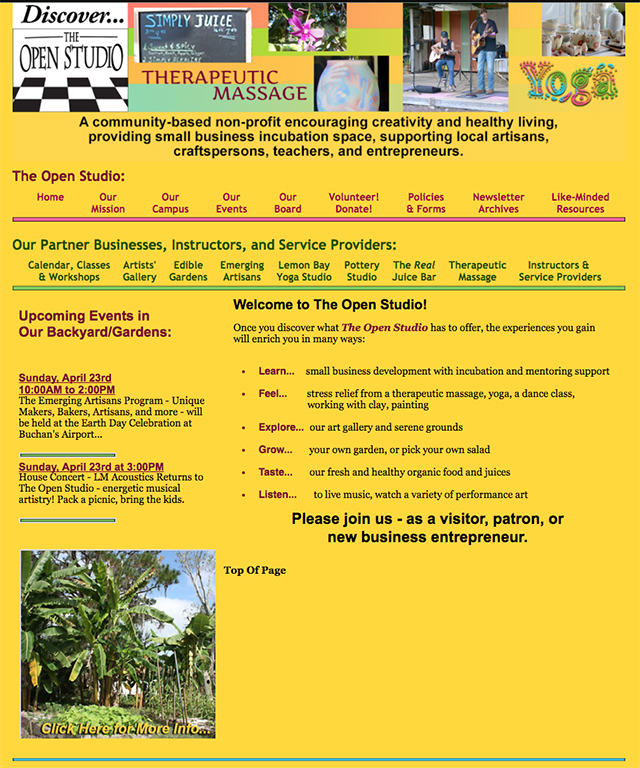
Website Design Example: Non-Profit Business Incubator/Client Businesses
|
This website presented a serious challenge - how to design and present two websites in one - one for the "umbrella" non-profit business incubator itself, and a second that contains the individual mini-websites for the Partner businesses.
|
|
Top of Page
Home | Writing | Graphic Design | Illustration | Imaging | 3D... | Interactive/Motion Graphics/Animation
Websites | Mechanical Artwork | Logos/Trademarks | Fireworks | Photography | Music | Contact Me
Phone: 941-500-3443 Email: bill.lundgren52@gmail.com
© Copyright 2015 - Bill Lundgren; All rights reserved.